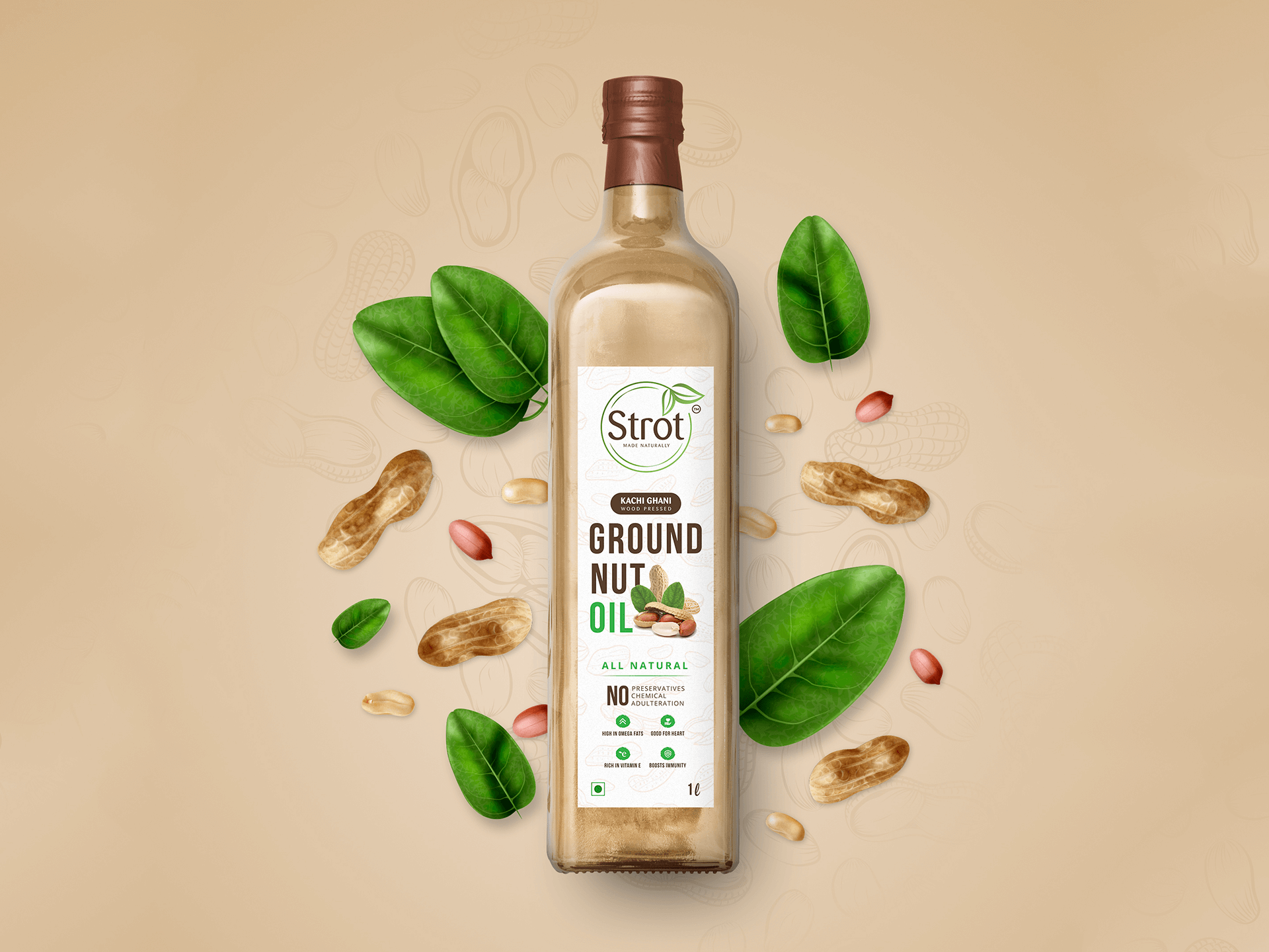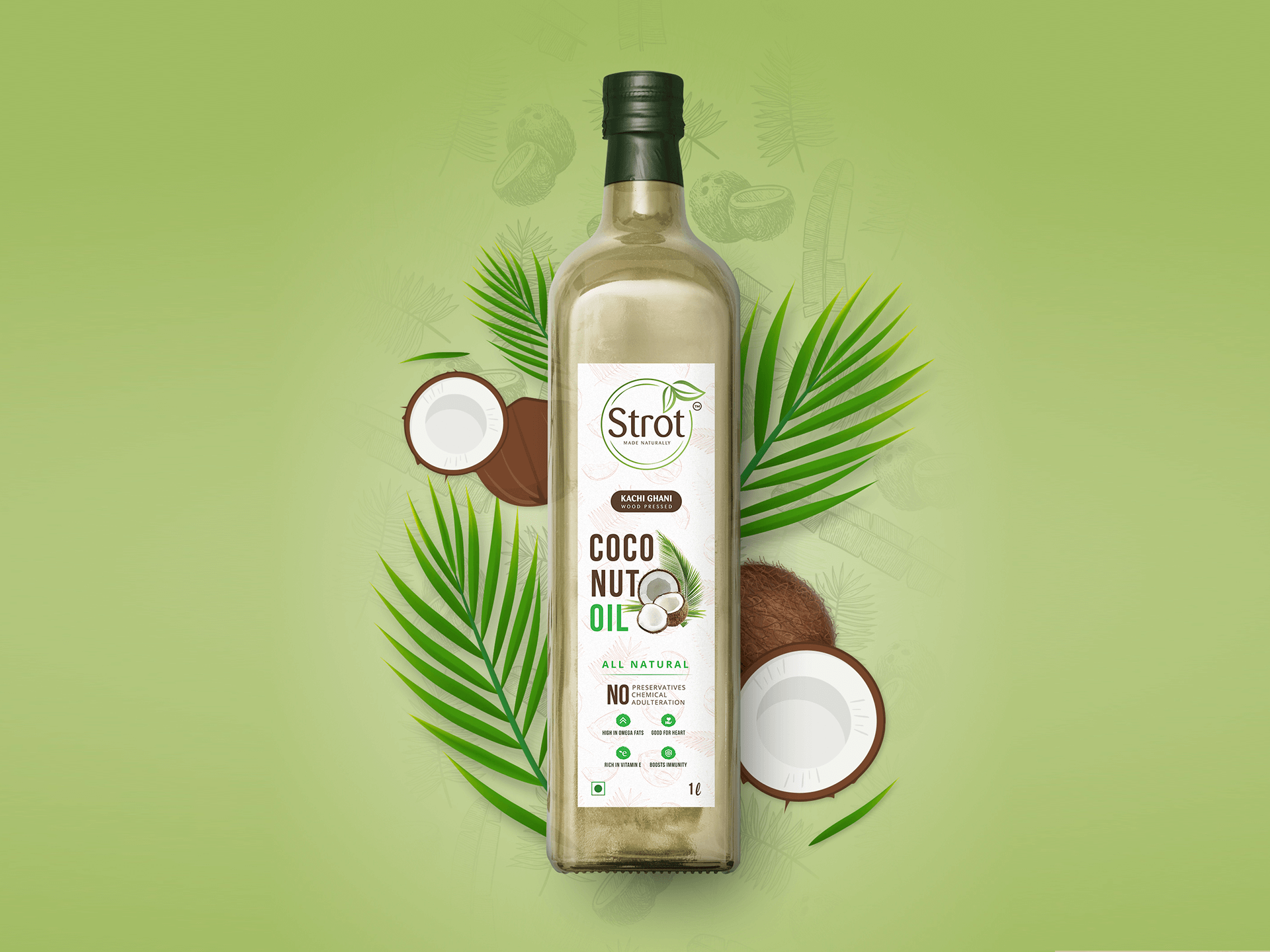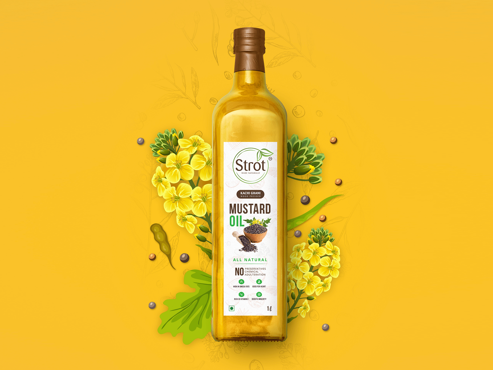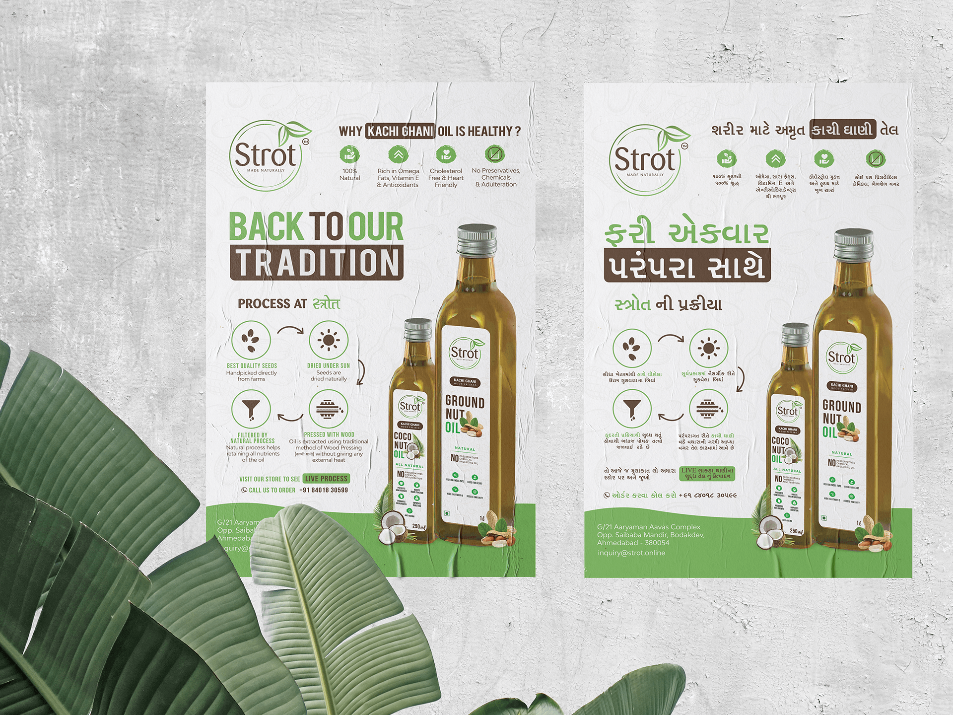


Strot is a Sanskrit word meaning "point of origin", the client started this brand keeping in mind two elementary goals- making a product that is 100% natural and the process involved in pressing of oil should retain maximum nutrition intact. The product falls into the premium category thus we had to design something that not only looks amazing but justifies the price. Strot as a brand strongly stands for all natural processes and complete transparency in its manufacturing process. They even have a live pressing line in their retail store.
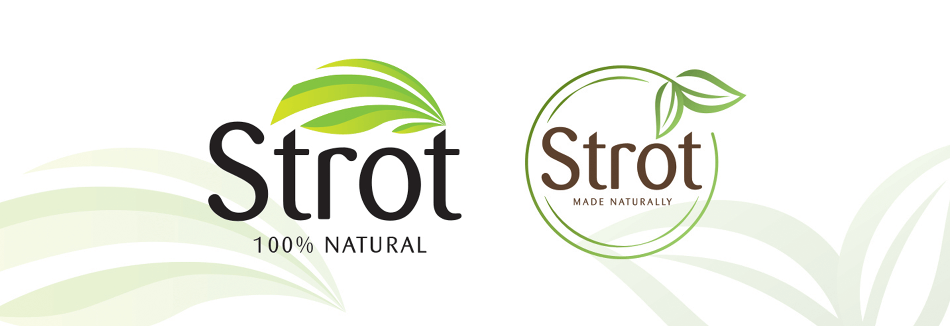
Eventually we came up with two designs that were comprehensive and in align to what client wanted. The fonts have been elegantly designed in a way that it subtly carries the vibe of thick viscous fluid, which is very evident in termination points of letter S and R. The circular shape symbolizes sun or ultimate source, quite literal meaning strot. Placement of leaves in the main logo form enhances the brands association with natural processes.
